Shipper Web App
TL;DR
What is it?
A web app of a last mile logistics company to be used by online sellers to create orders and track their shipments.
The Design (it’s reactive!)
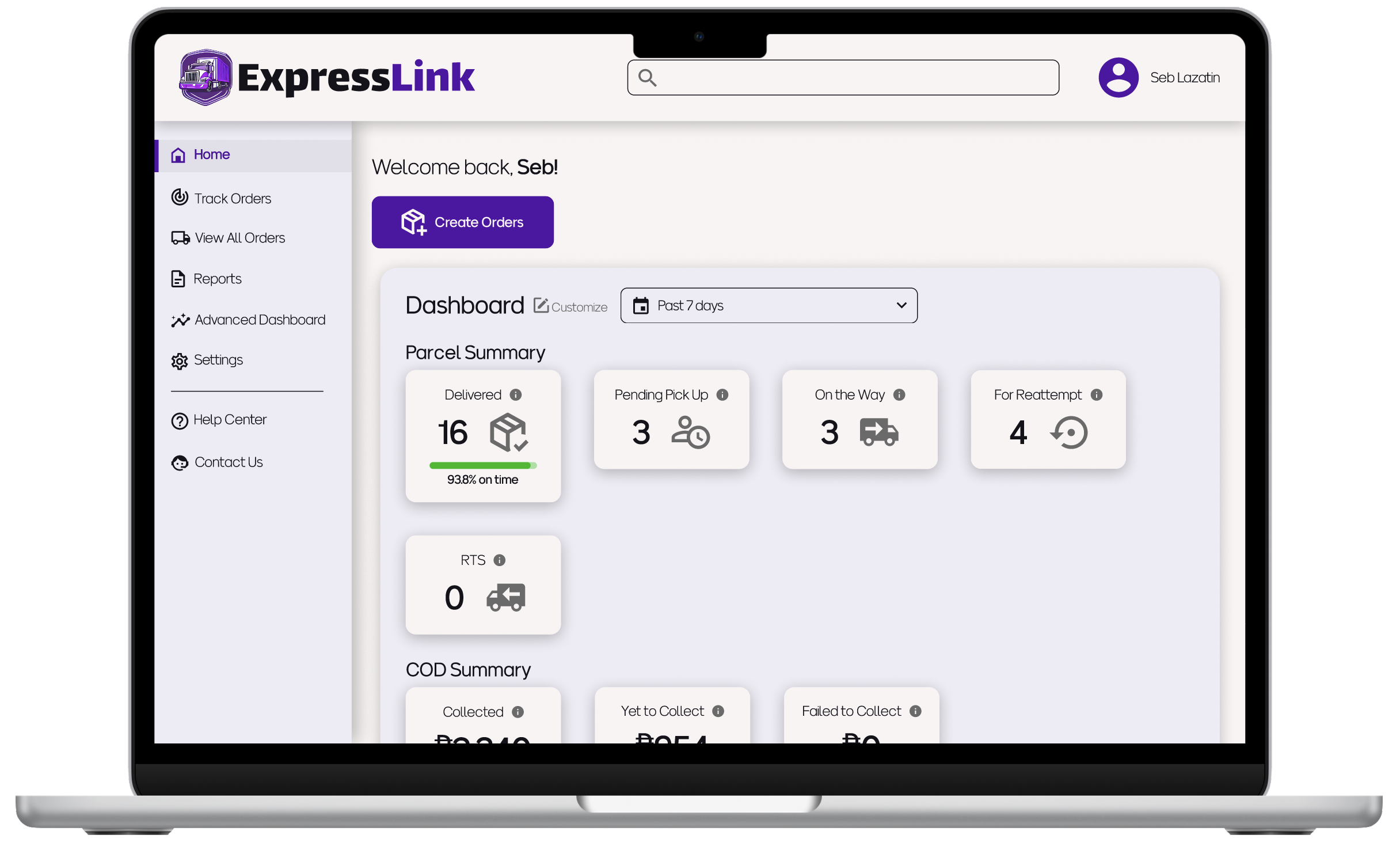
Macbook Air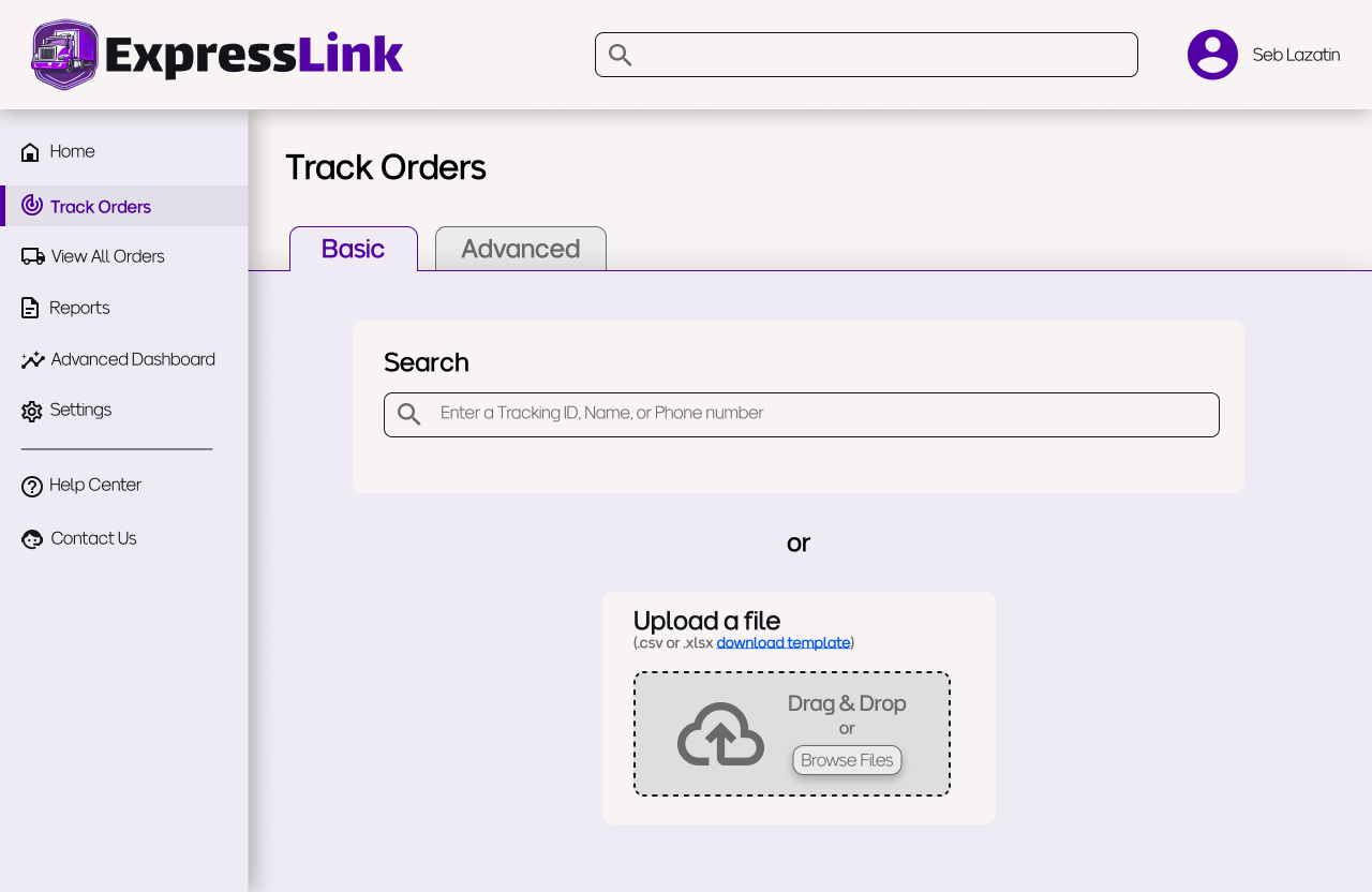
Macbook Pro 14"
Macbook Pro 16"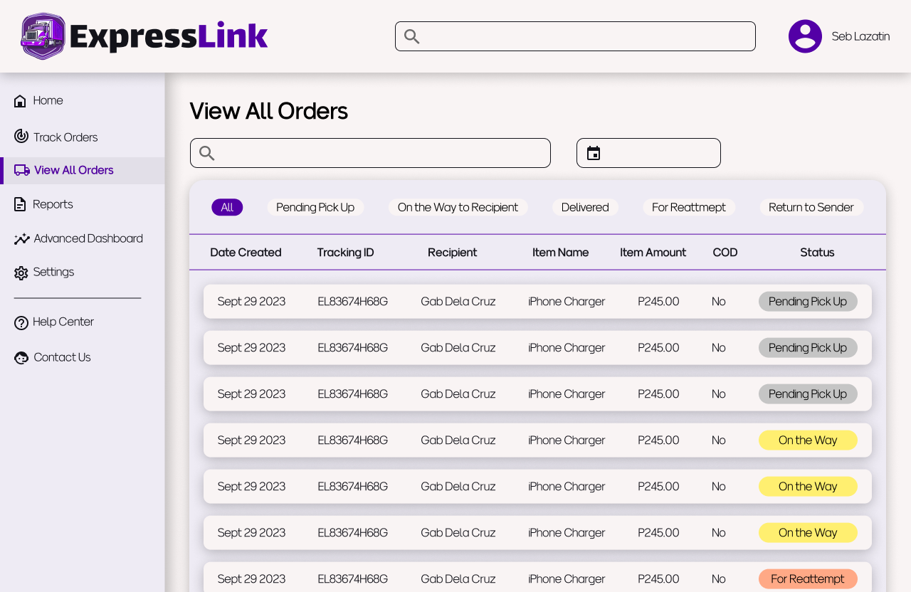
Introduction
The Problem
E-commerce has had a boom over the last couple of years, yet some of the big players in the logistics industry have websites with poor user experience (see my blog post about LBC’s site). This can cause inefficiencies in online sellers’ workflows and even affects the consignee’s experience with the seller.
The Solution
A web app that prioritizes presenting relevant information to the user and clear navigation so users can always find what they are looking for when they need it.
The Premise
My goal was to create a useful and usable web app for the customers of a last mile logistics company.
One of the projects that never fully materialized during my time as a Customer Experience Manager at a logistics company was the revamping of the web app’s dashboard. There had been complaints about its usability, but other projects took precedence. I wanted to take on the challenge of following through with this project, even if it wouldn’t actually be implemented.
The Approach
-
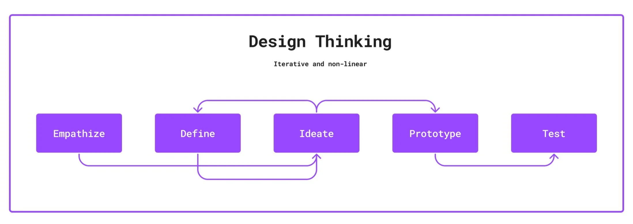
I used the Design Thinking framework
I drew from previous work experience to create two personas
I made digital wireframes on Figma
I wanted to make sure navigation was seamless and users always know where they are on the site
I used the Design Thinking framework. I started to flesh out my ideas for personas on paper since I had a lot of actual work experience to draw from and I needed a way to get all my thoughts out first then refine from there.
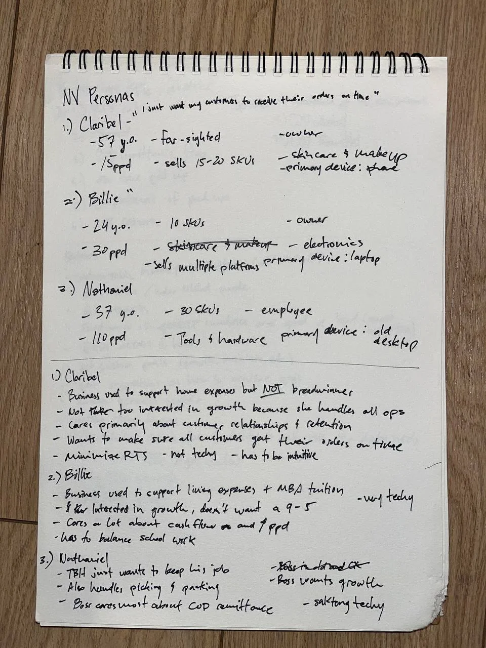
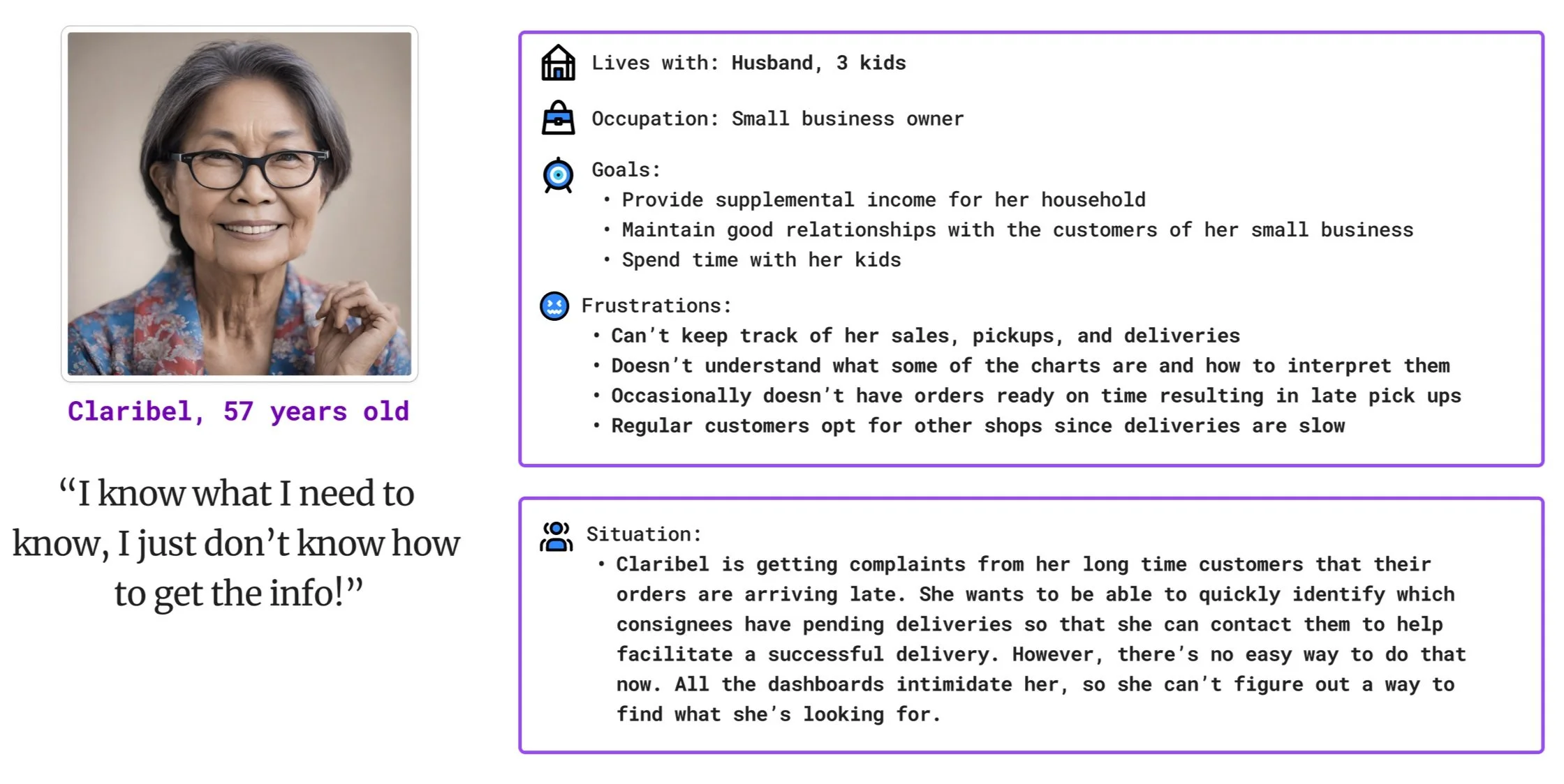
To the left is my initial draft of the personas. I originally had three, but I decided to remove one of them (Billie) after consulting some people I know who are in the e-commerce or logistics industries. Billie was supposed to be a data nerd taking up their masters degree, but it seems like there aren’t enough users like them to justify a third persona.
Persona 1
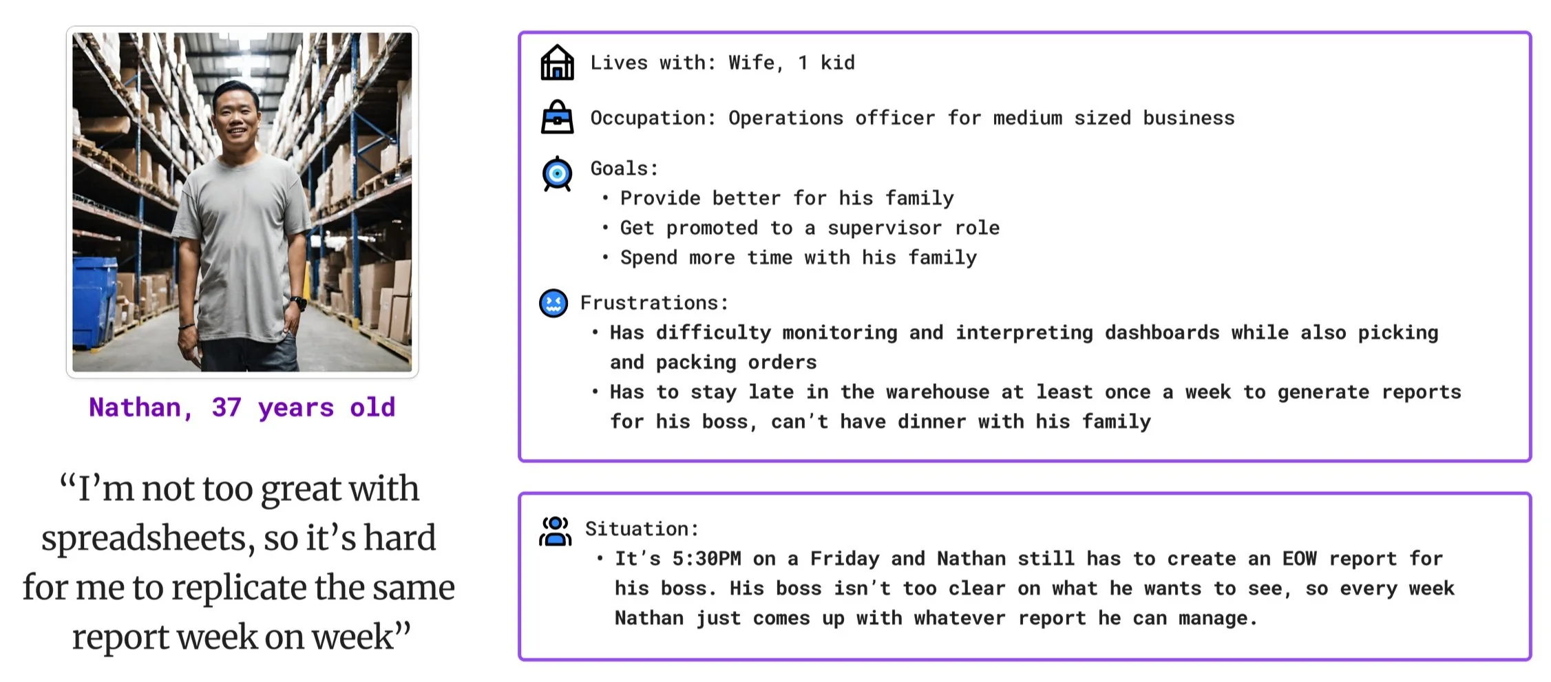
Persona 2: Nathan
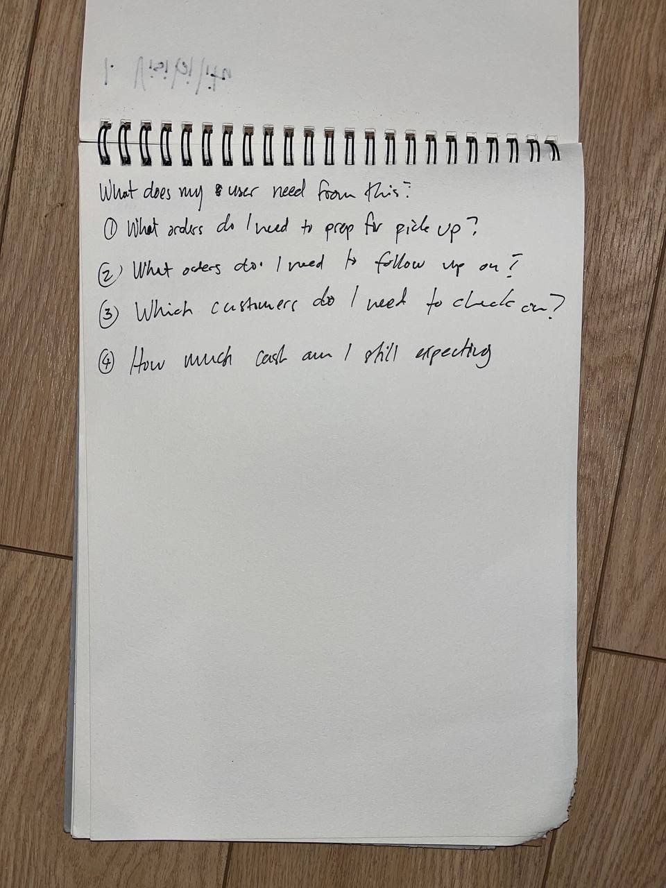
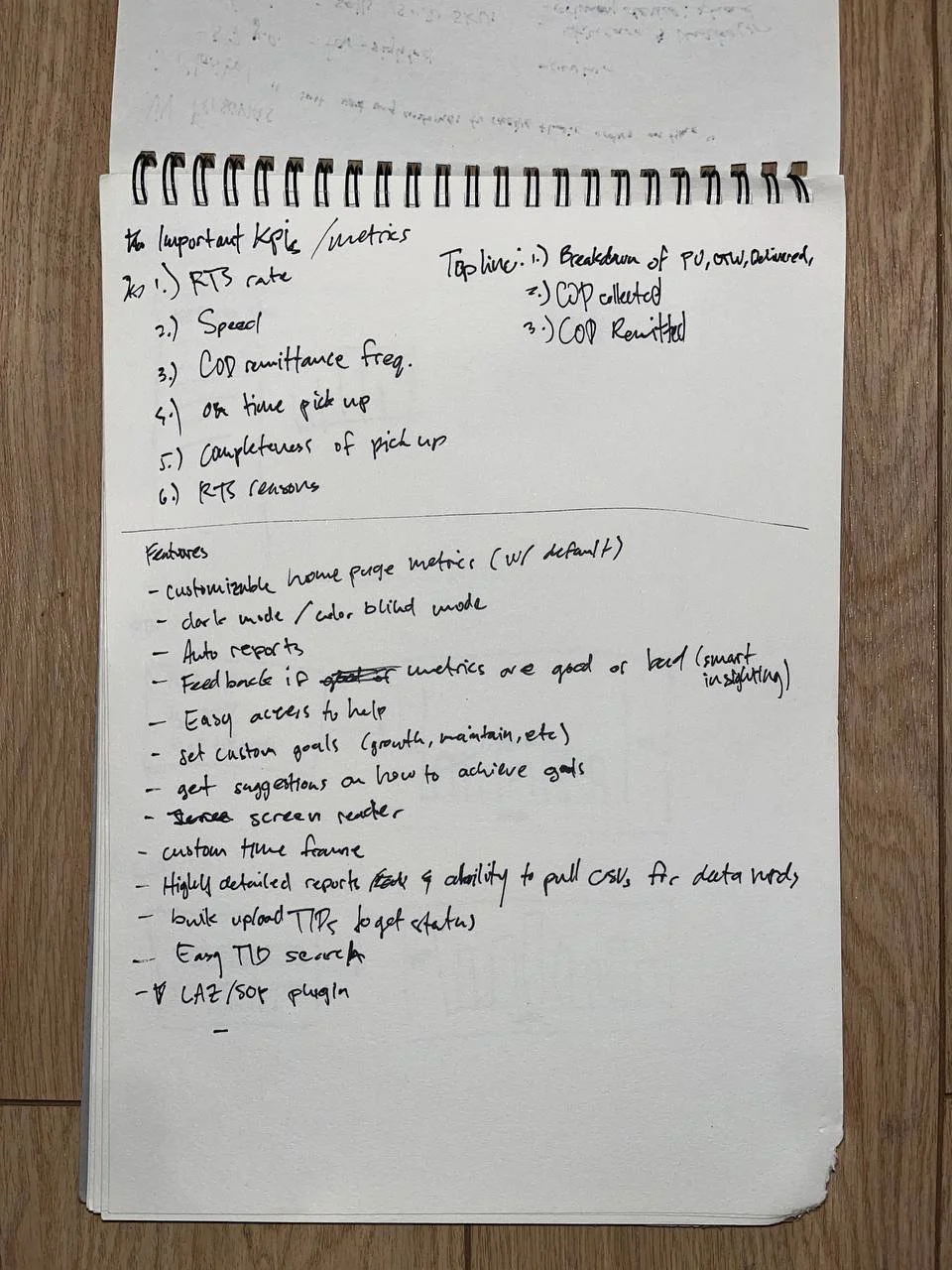
Below are some photos of my notes from my ideation sessions. On the left, I wrote down some questions a shipper may want answered while monitoring their parcels, or while picking and packing orders. On the right, I just dumped all of the important KPIs and metrics, as well as some useful features for the web app. My mindset here was to make it a divergent process and focus on quantity over quality.
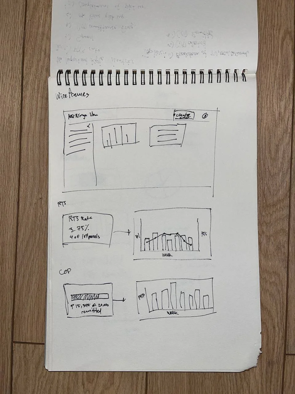
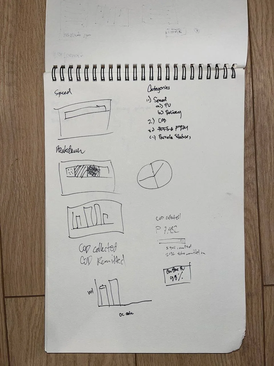
I moved on to drafting some of the charts for the dashboard. I have experience creating these types of charts and graphs for work, but I had to keep in mind that my audience was different back then. I was communicating with people who had a familiarity with what all the metrics meant, and how to interpret them. Now, I was communicating with users who may not have the same level of familiarity, or may not have the time to scrutinize the graphs. They should be able to know what they need to know at a glance.

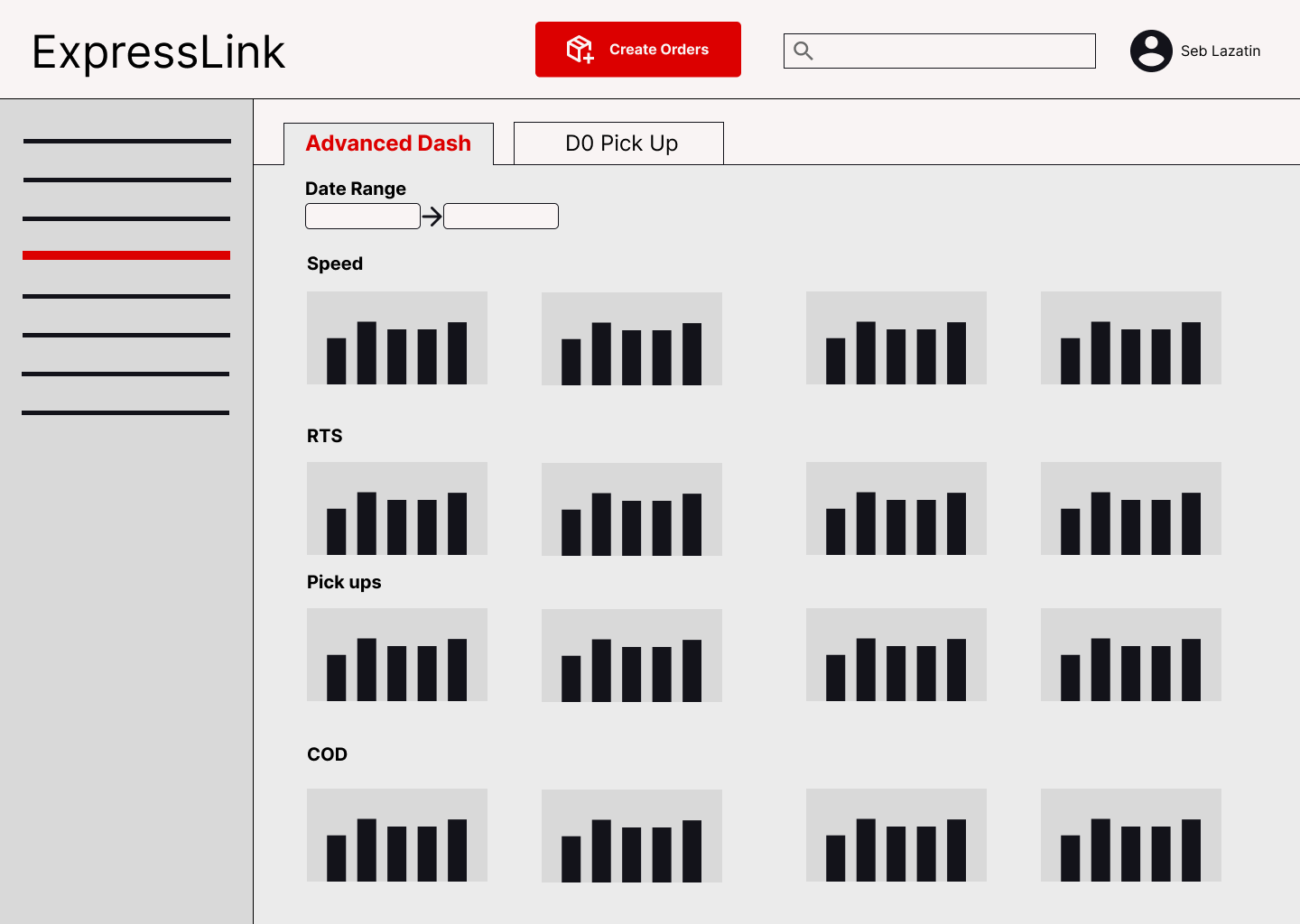
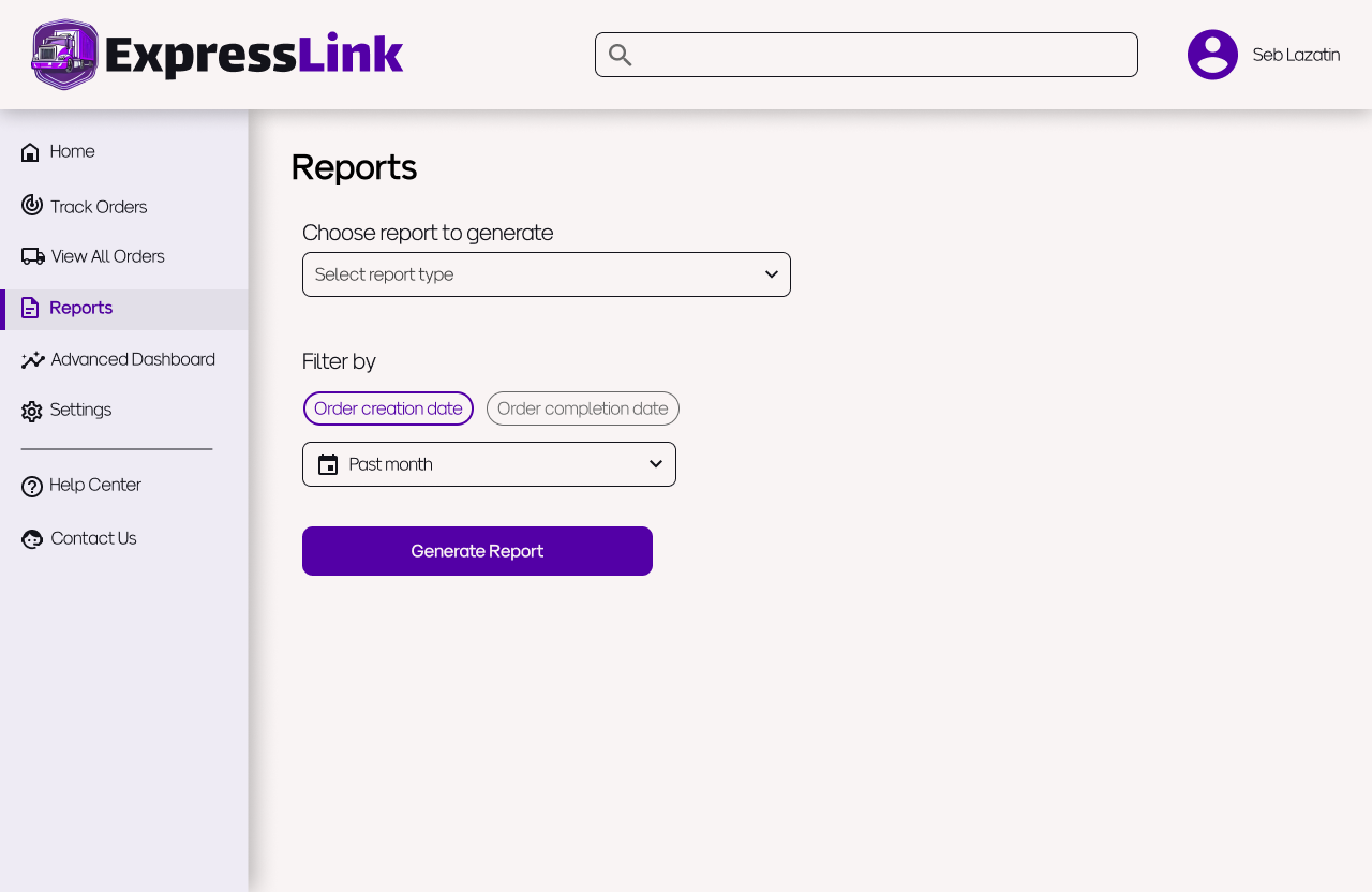
These are the digital wireframes that I made on Figma. I wanted to make sure that navigation was straightforward, and that the user would always know where they are on the site. I prioritized this since users tend to be doing other things throughout the day while monitoring their parcels, so it can be easy for them to forget what they were doing, or how to get to a new page.
Design Notes
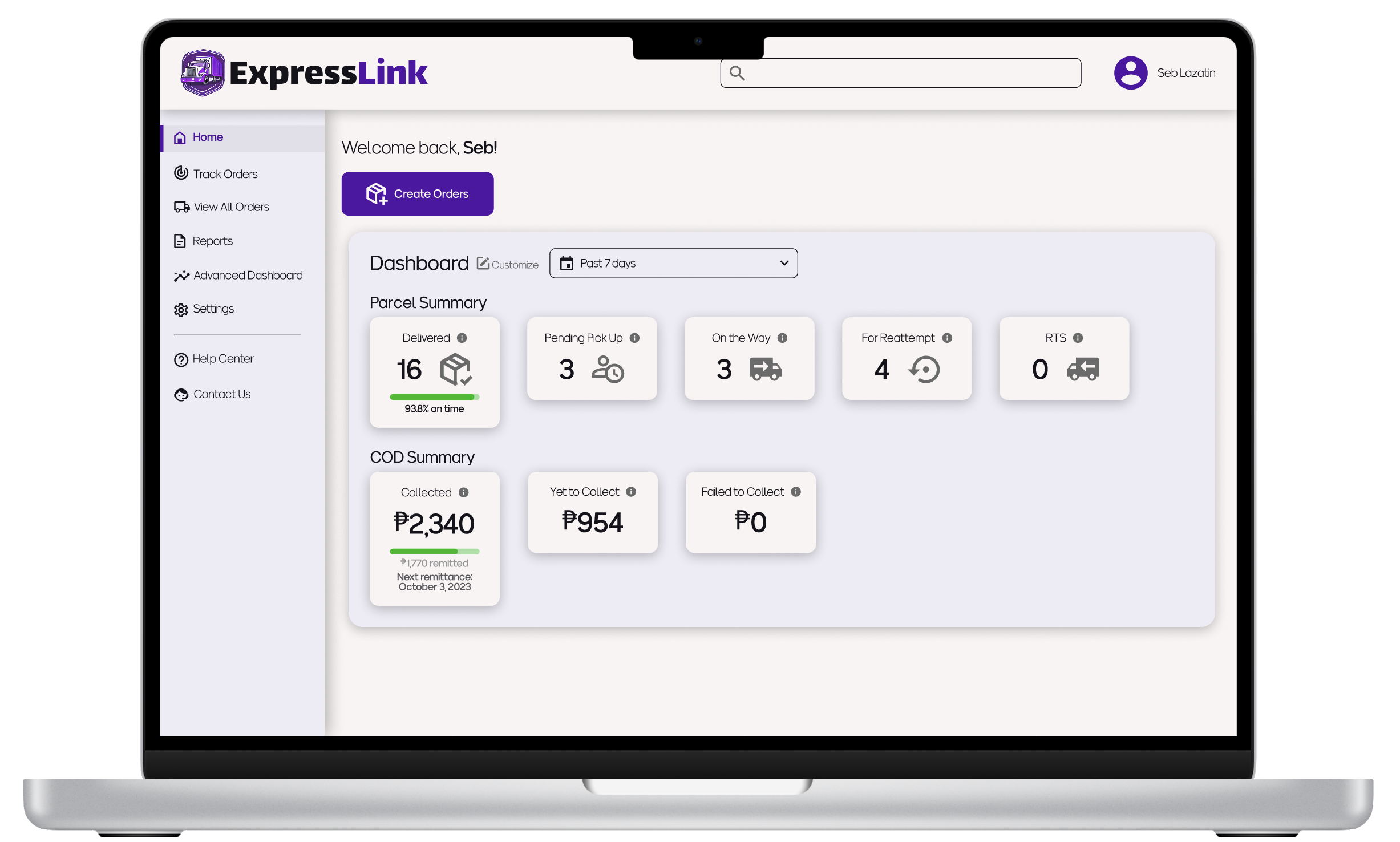
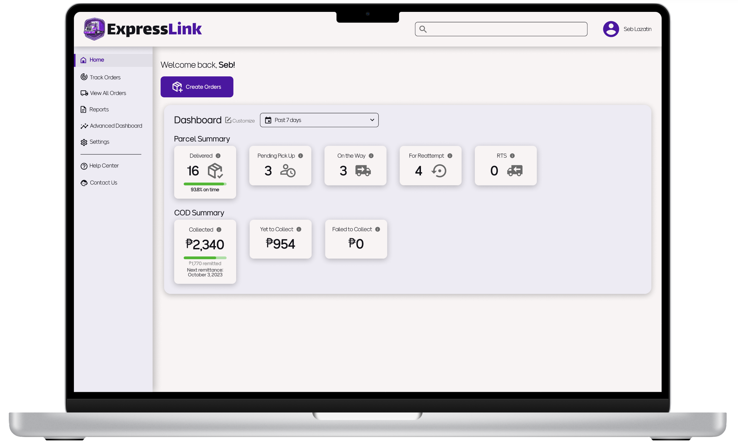
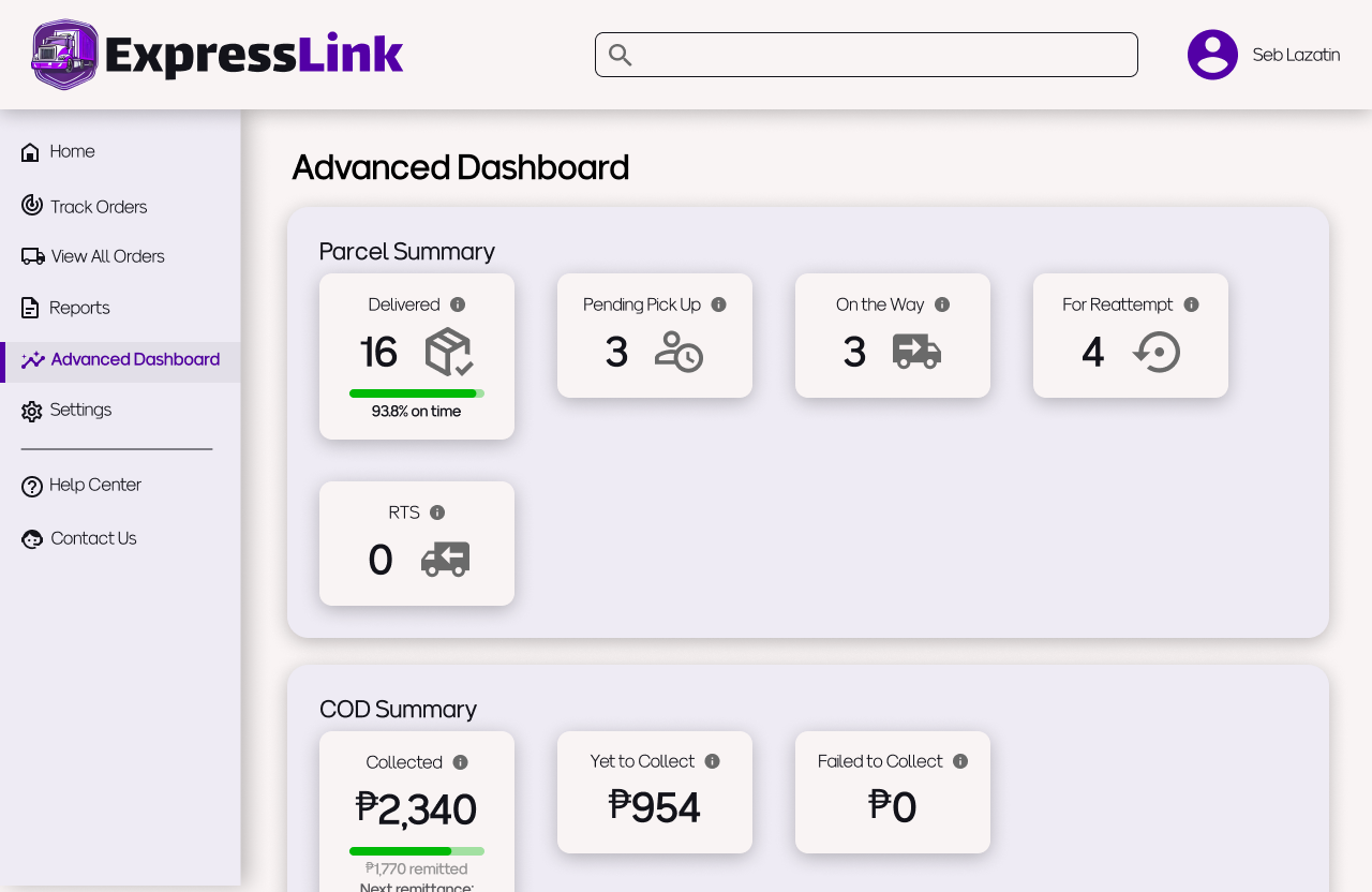
Homepage

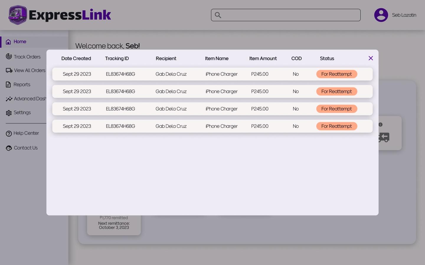
The charts on the homepage dashboard are there to inform the user of any immediate actions they need to take. For example, if there are some parcels that need to be reattempted for delivery, the user may have to communicate with the recipient to facilitate a successful delivery. Clicking on the chart will open a pop up that shows all of the relevant parcels.
There are also info bubbles for each chart that open upon hovering, in case the user needs clarification on what the figure actually represents.
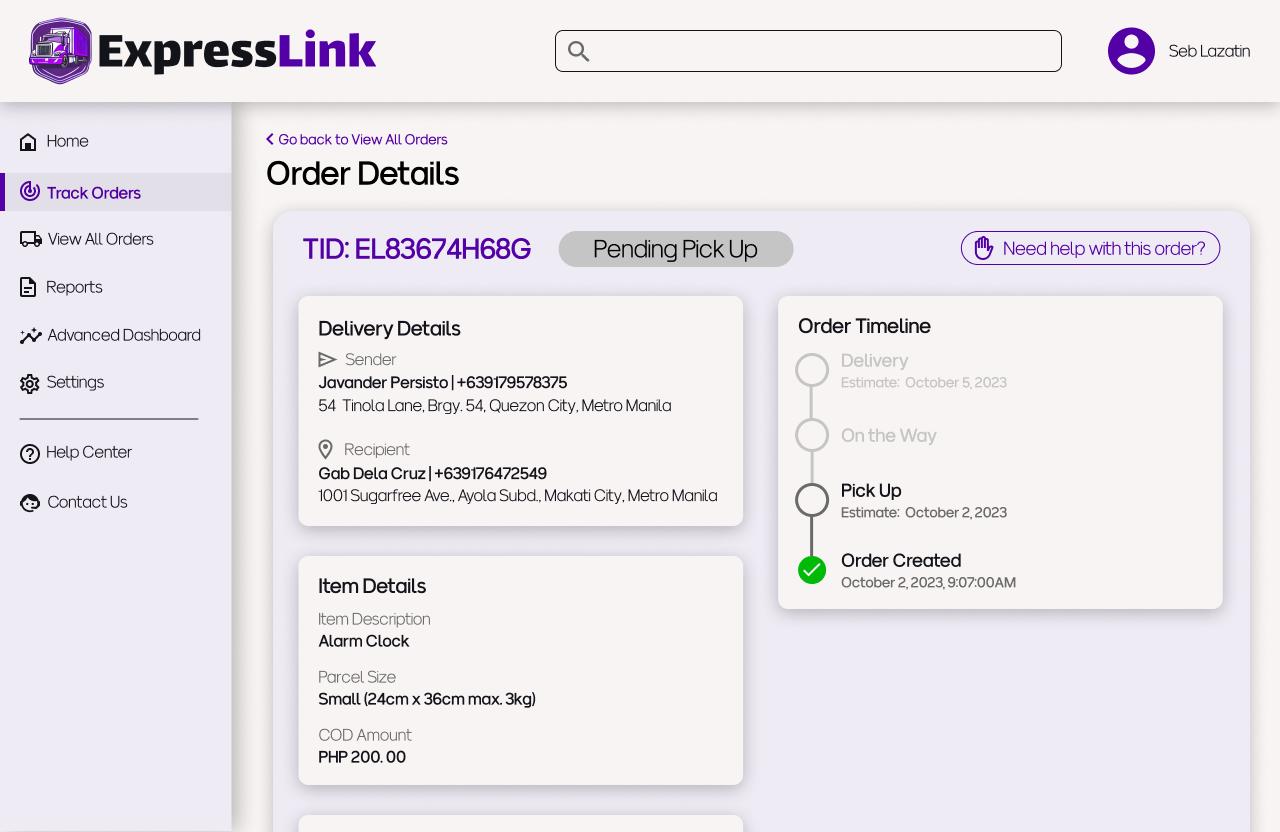
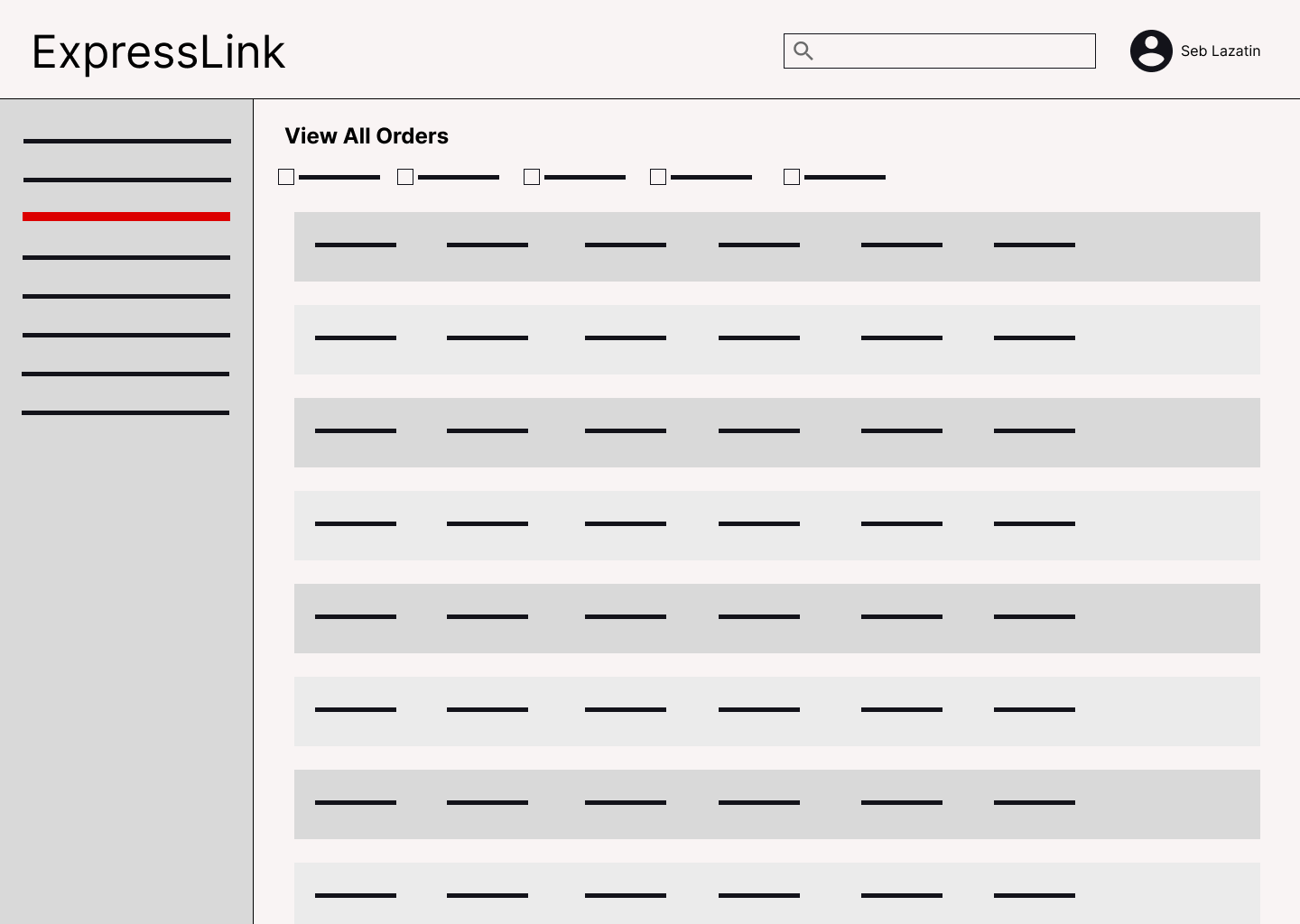
Looking for orders
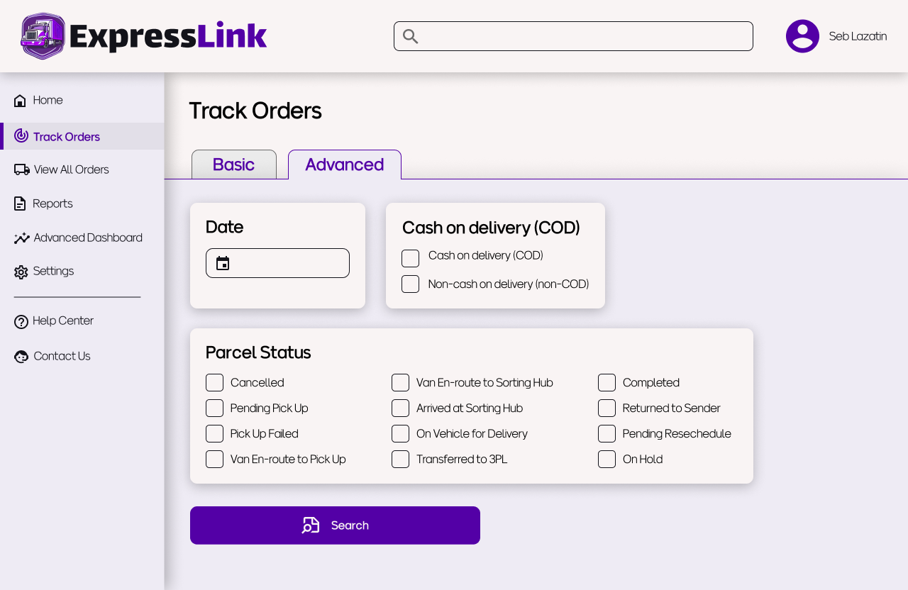
Users are always looking for information on specific parcels since their customers tend to follow up on their orders quite often. It’s important that the web app supports this and makes users feel like orders are always accessible. The homepage already allows quick access to orders based on their status, and the top navigation bar has a search function, but below are three other ways that users may look for orders


The basic tracking function has a search bar for Tracking IDs or customer information, as well as a bulk search feature which allows users to search for multiple TIDs by uploading a csv file.
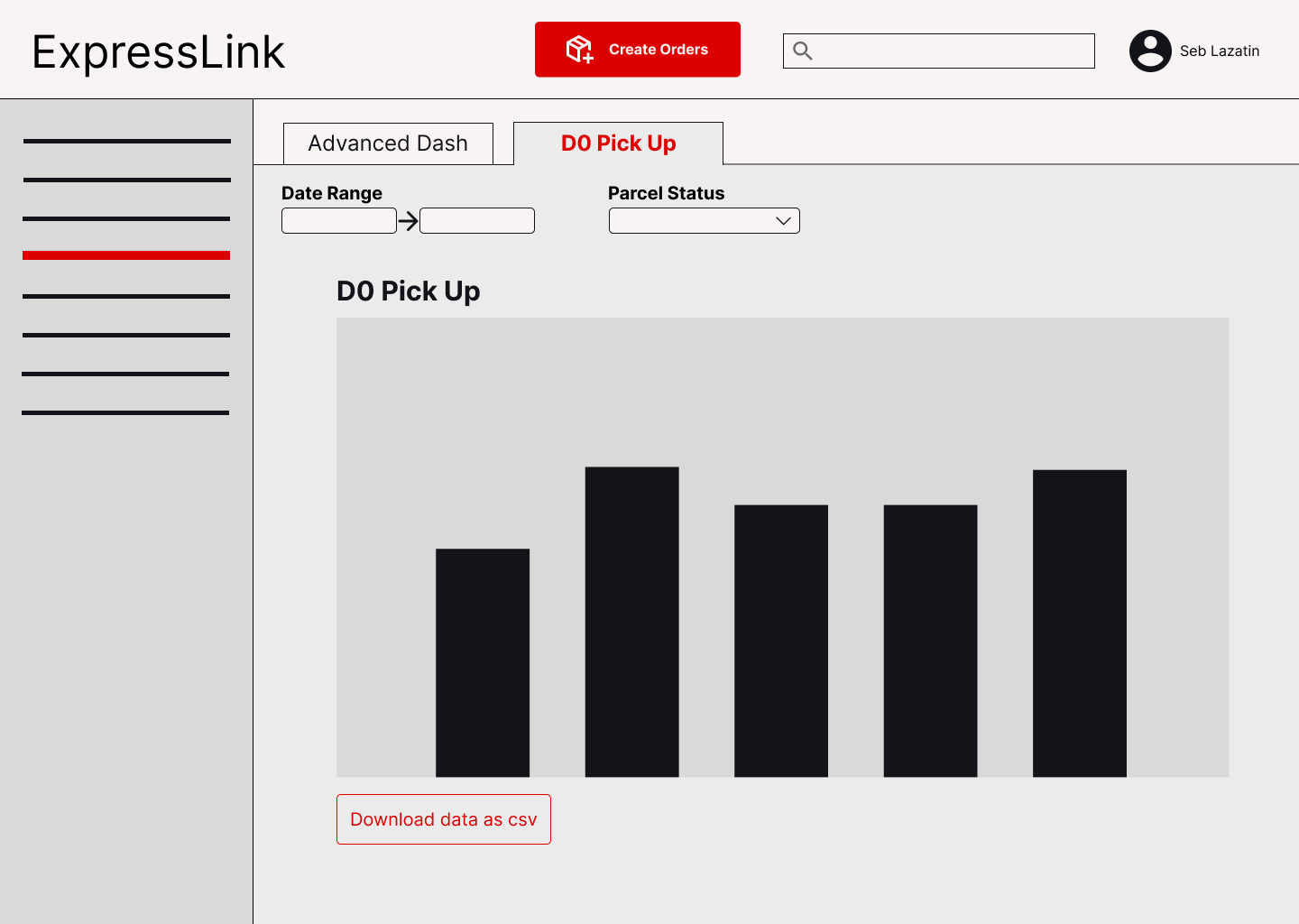
The advanced tracking function allows for more filtering, by date, COD type, and parcel status
The view all orders page allows you to…well, view all orders. It also allows you to quickly filter orders by parcel status.