
GCash Redesign
TL;DR
What is it?
This is a redesign of GCash meant for people who are not tech savvy.
This is a hypothetical project, and I have no affiliation with GCash.The Design
Introduction
The Problem
GCash is the most widely used e-wallet in the Philippines. However, the design of the app proves to be confusing to users who aren’t tech savvy. This causes the user experience to be less than satisfactory, especially for older users. A separate mode for users who only need the basic functions could help increase adoption of GCash across the country.
The Solution
I redesigned GCash with the intention of simplifying the user interface for more pleasant user experience. It was still important, however, to maintain the key elements of the app so that existing users wouldn’t feel lost. I also took the liberty of changing the aesthetic style since this is just a hypothetical project.
The Impetus
My goal was to create a version of GCash that’s approachable for people who aren’t tech savvy.
I got my mom to start using GCash in 2020, but until now she still has her moments of confusion while using the app. Not too long ago, I would have placed the blame on her for not remembering how to do simple tasks on the app, but I eventually realized that it’s actually a design problem.
The Approach
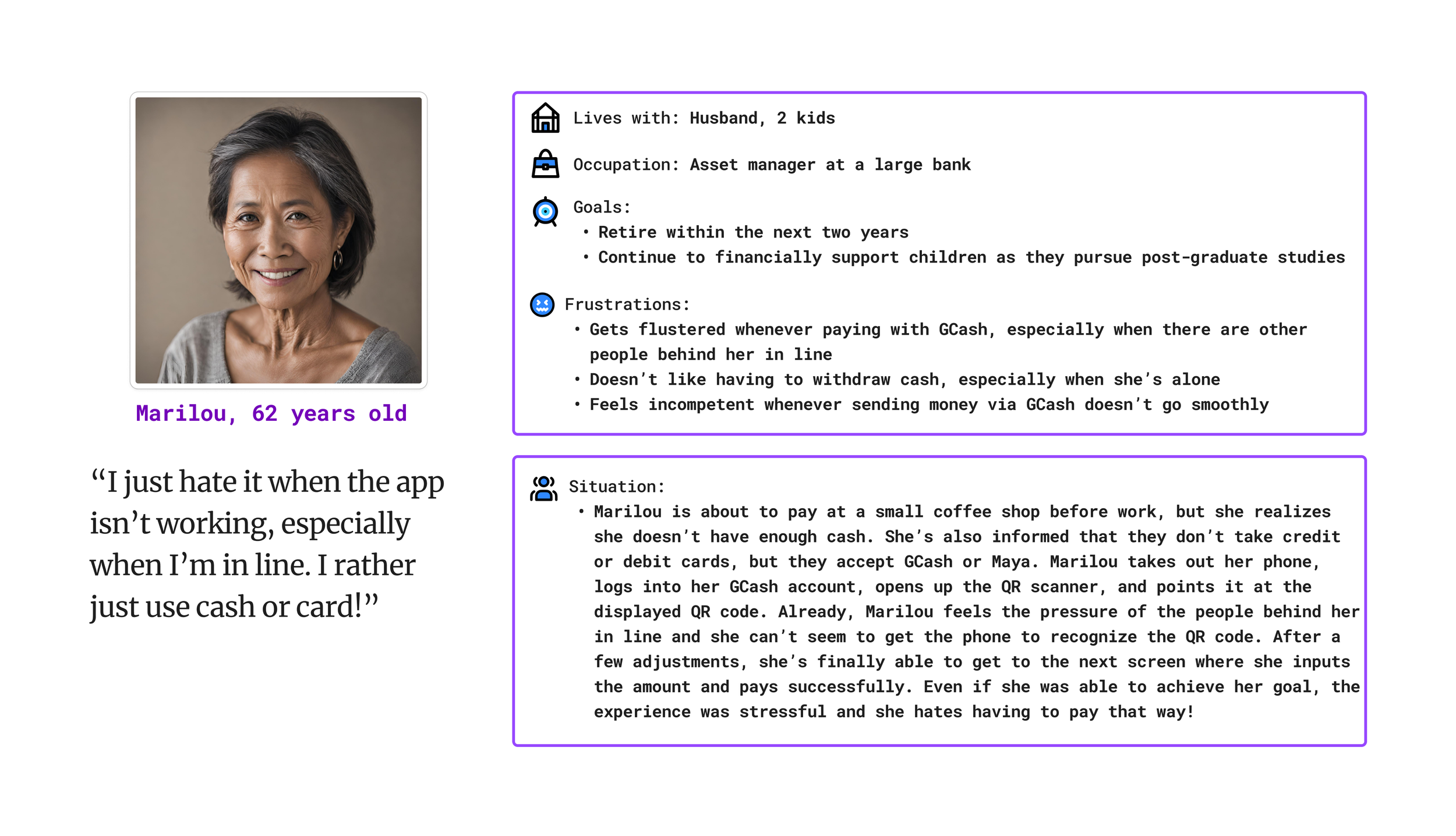
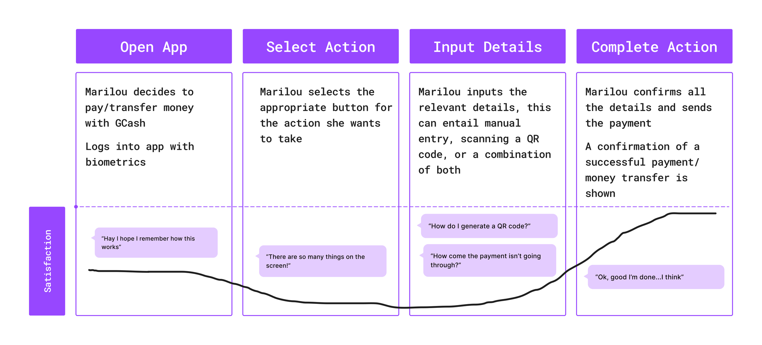
I used the Design Thinking framework. I began at the empathize step since I have inadvertently been emphathizing with my mom for the past three years! I created a persona and customer journey map based on my observations, as well as an interview to kick off the define phase.
Persona
Customer Journey Map
I created paper wireframes to help flesh out my ideas and to iterate quickly between them. Once I had an idea of where I was heading, I made digital wireframes on Figma.
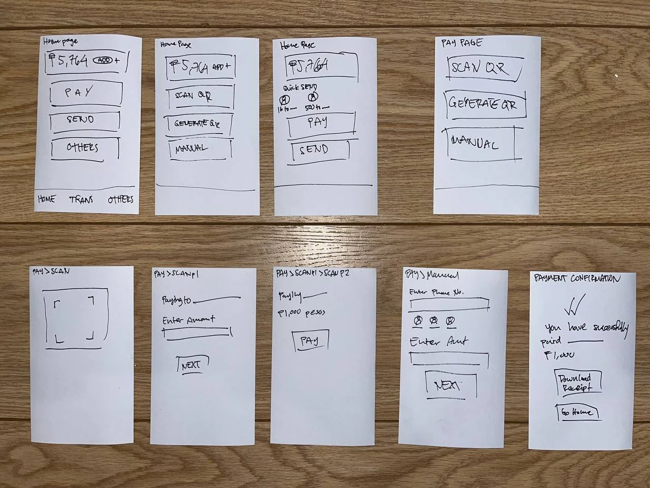
Photo of paper wireframes drawn on index cards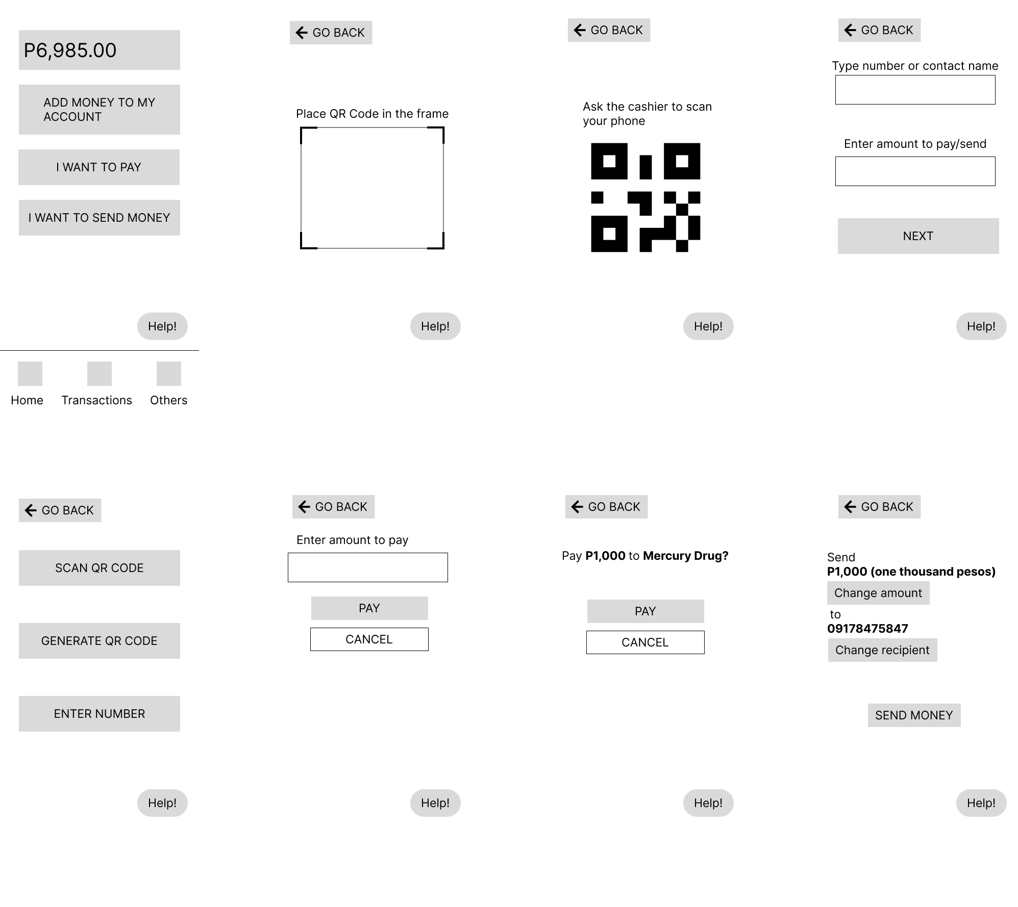
Digital wireframes made using FigmaDesign Notes
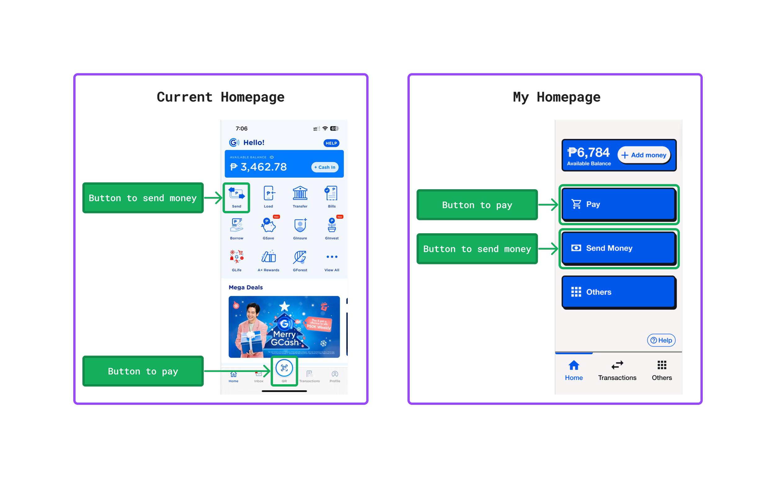
Critique of Homepage
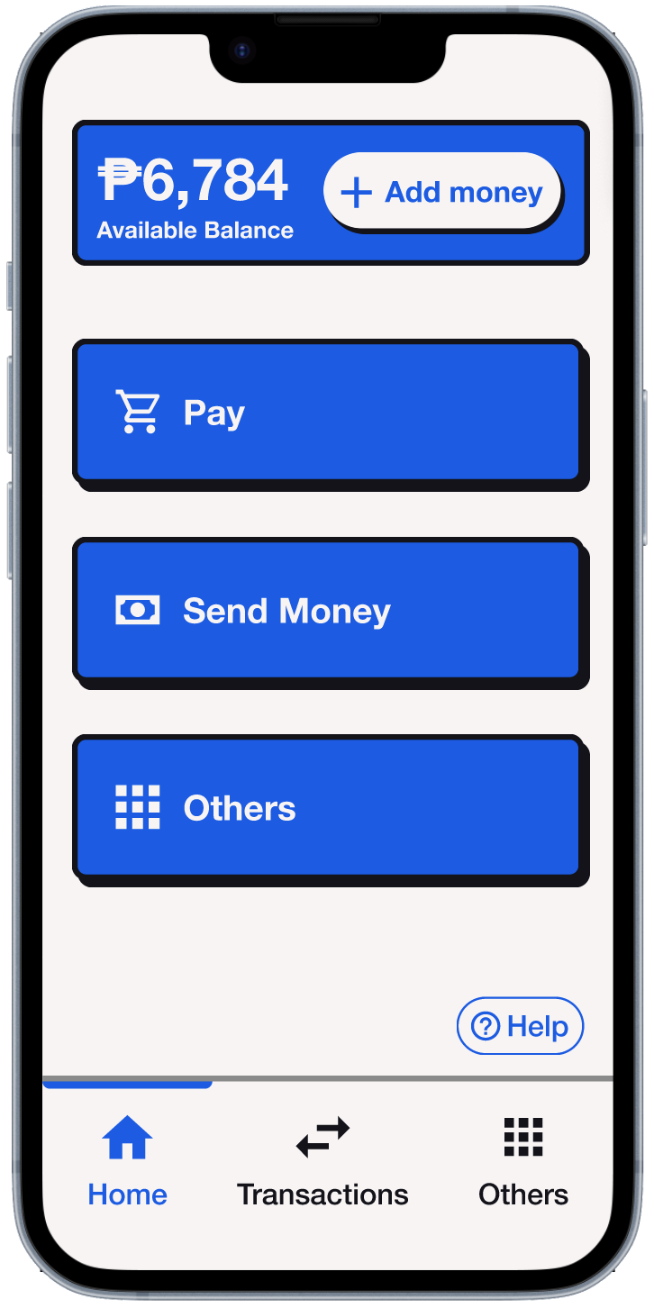
Homepage
-
The two most frequently used functions on GCash are sending money and making payments, yet this is not evident by the current UI. The user is presented with so many options on the homepage, most of which are rarely, if ever, used. This violates one of Jakob Nielsen’s 10 Usability Heuristics for UI Design: aesthetic and minimalist design.
-
The pay button’s label is “QR”, which is not clear at all. In fact, a user won’t encounter the word “pay” when trying to pay for something until a few steps into the process.
Based on my experience, the term “cash in” can also be vague, especially for older users. I would of course conduct user research to check if this is actually an issue, and what a better label would be.
-
That’s all haha.
Changes made to homepage
-
I removed most of the buttons on the homepage, and moved them to a completely separate page, leaving only the most used functions.
-
“QR” to “Pay”
“Cash In” to “Add Money” (though I would conduct user research to figure out what label would be the most clear for older users)
“Send” to “Send Money - I actually think “Send” may be sufficiently clear, but “Send Money” has less room for interpretation (and now there’s space for a longer label!)
-
Again, that’s all.
QR Codes

Critique of pay via QR process and UI
-
When you tap the QR button, it immediately opens up your camera — the app already decided that you’re gonna scan a QR code. The thing is, sometimes you pay by generating a QR code, not by scanning one. To add to this problem, it is not even immediately clear that you can generate a QR code from that screen (the button is below the scanning area, in case you missed it).
-
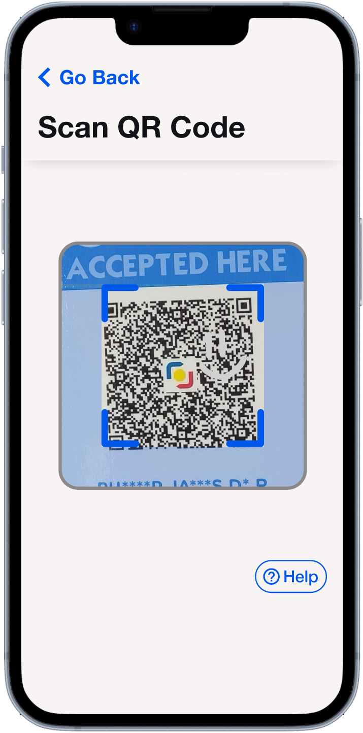
One time, I observed my mom struggling to scan a QR code because she was trying to get the corners of the code to match up perfectly with the corners of the frame. In reality however, the scanner will recognize the QR code as long as the whole thing is within the frame. Again, I would verify how widespread this problem actually is with usability testing, but for now it’s a problem I’m going to address.
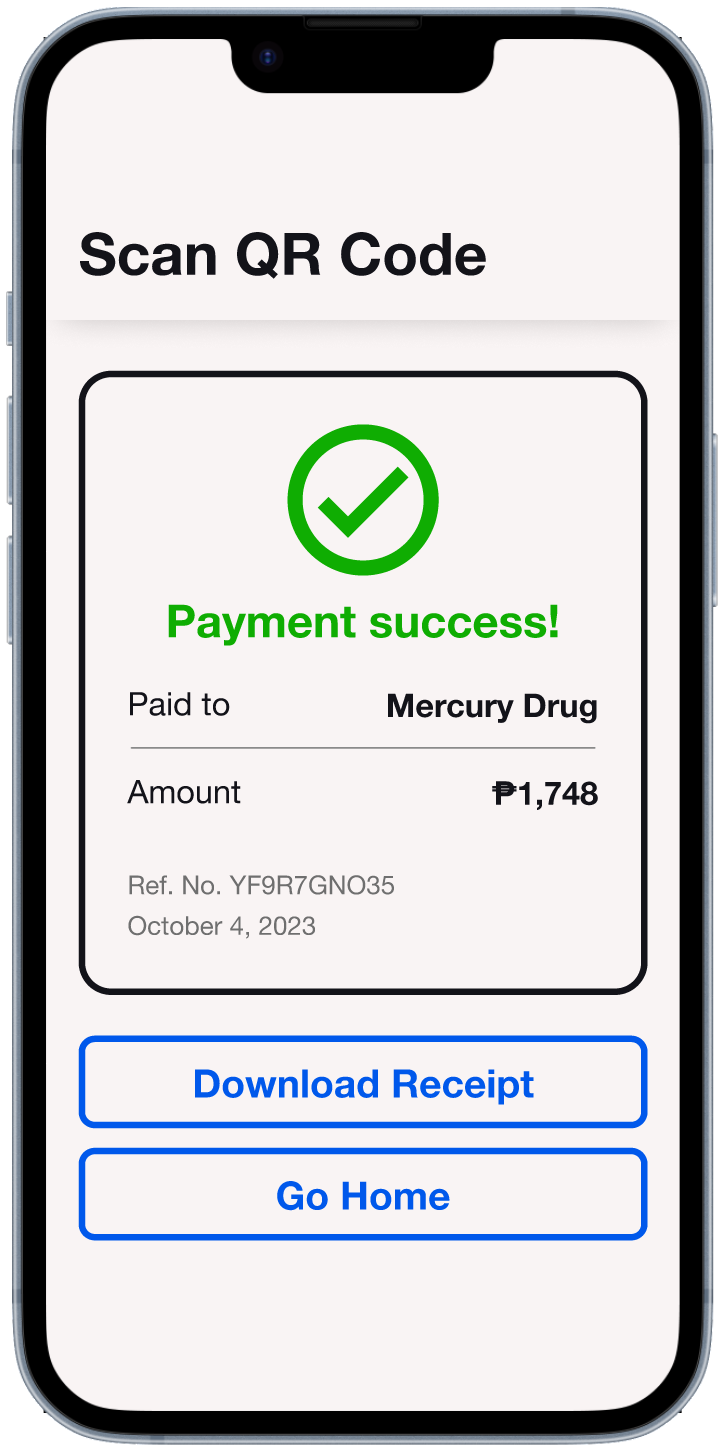
Changes made to pay via QR process and UI
-
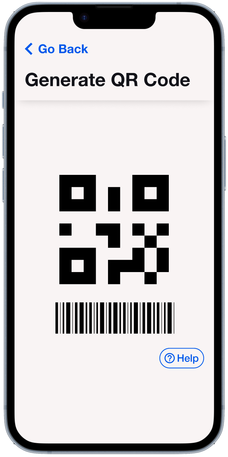
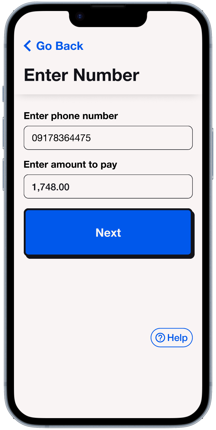
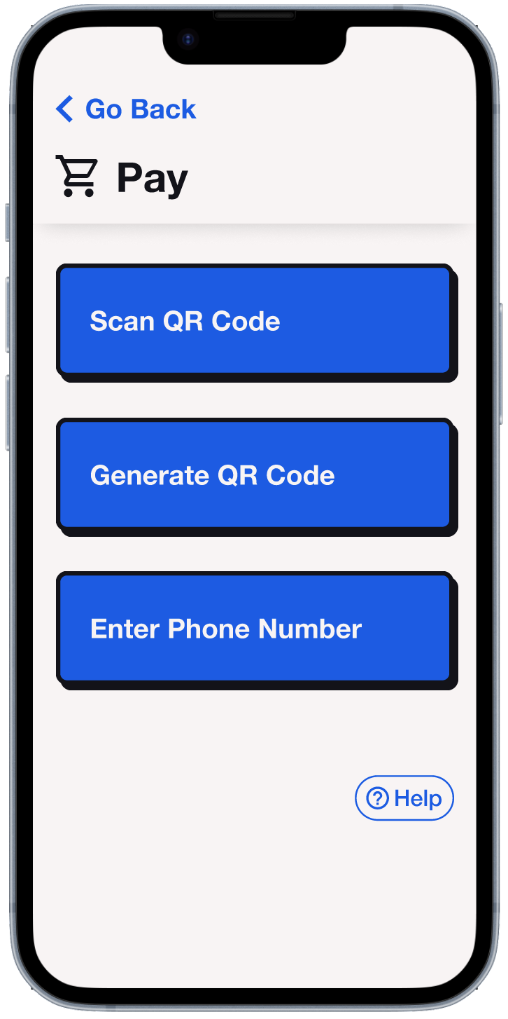
After tapping the pay button, the user will be offered 3 payment methods:
Scan QR code
Generate QR code
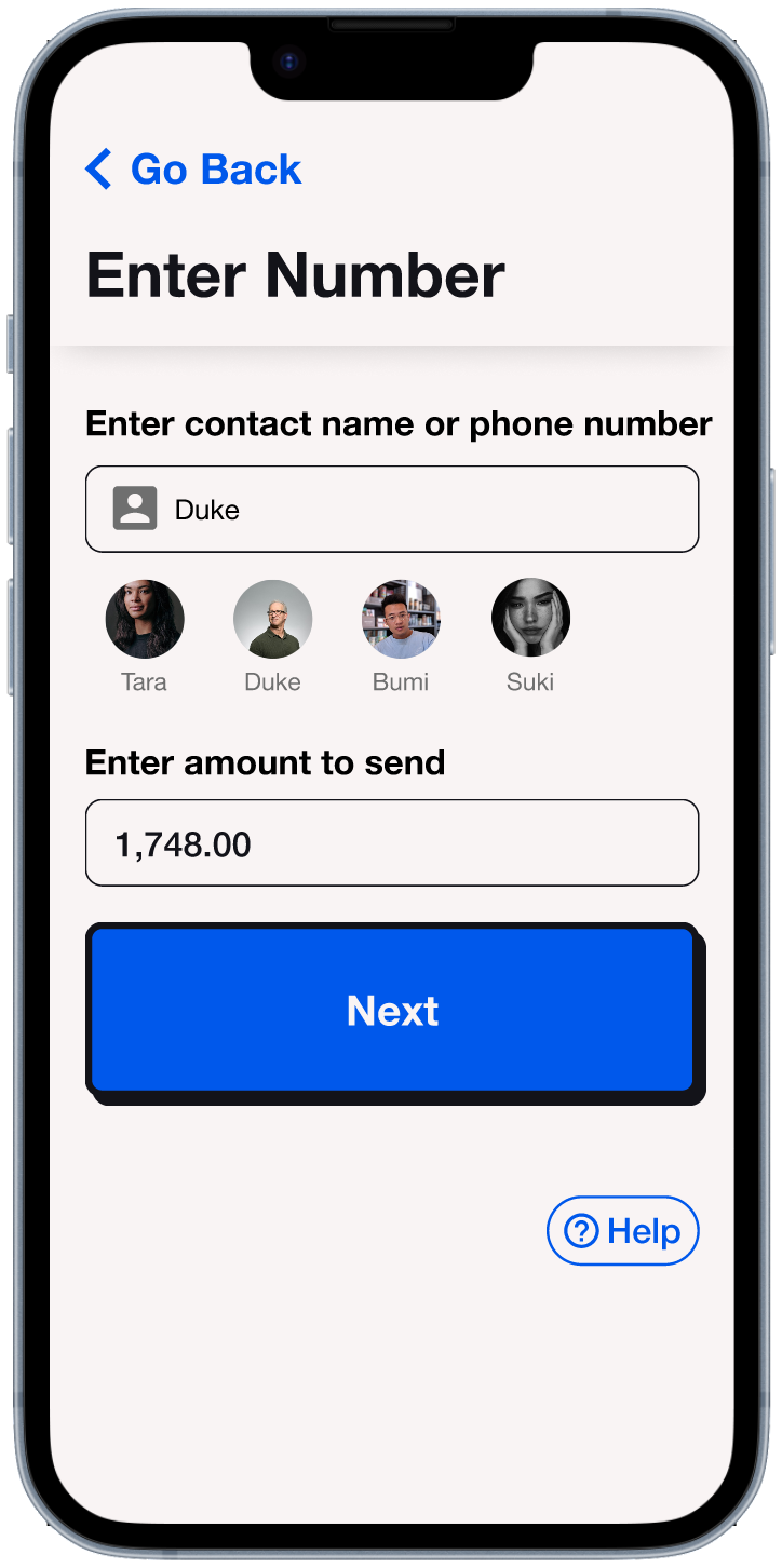
Enter phone number
-
I made the “target” of the scanner smaller than the actual scanning area. That way, if a user were to try and fit the QR code perfectly into the target area like my mom did, your phone will still be able to read the QR code.
Error Recognition
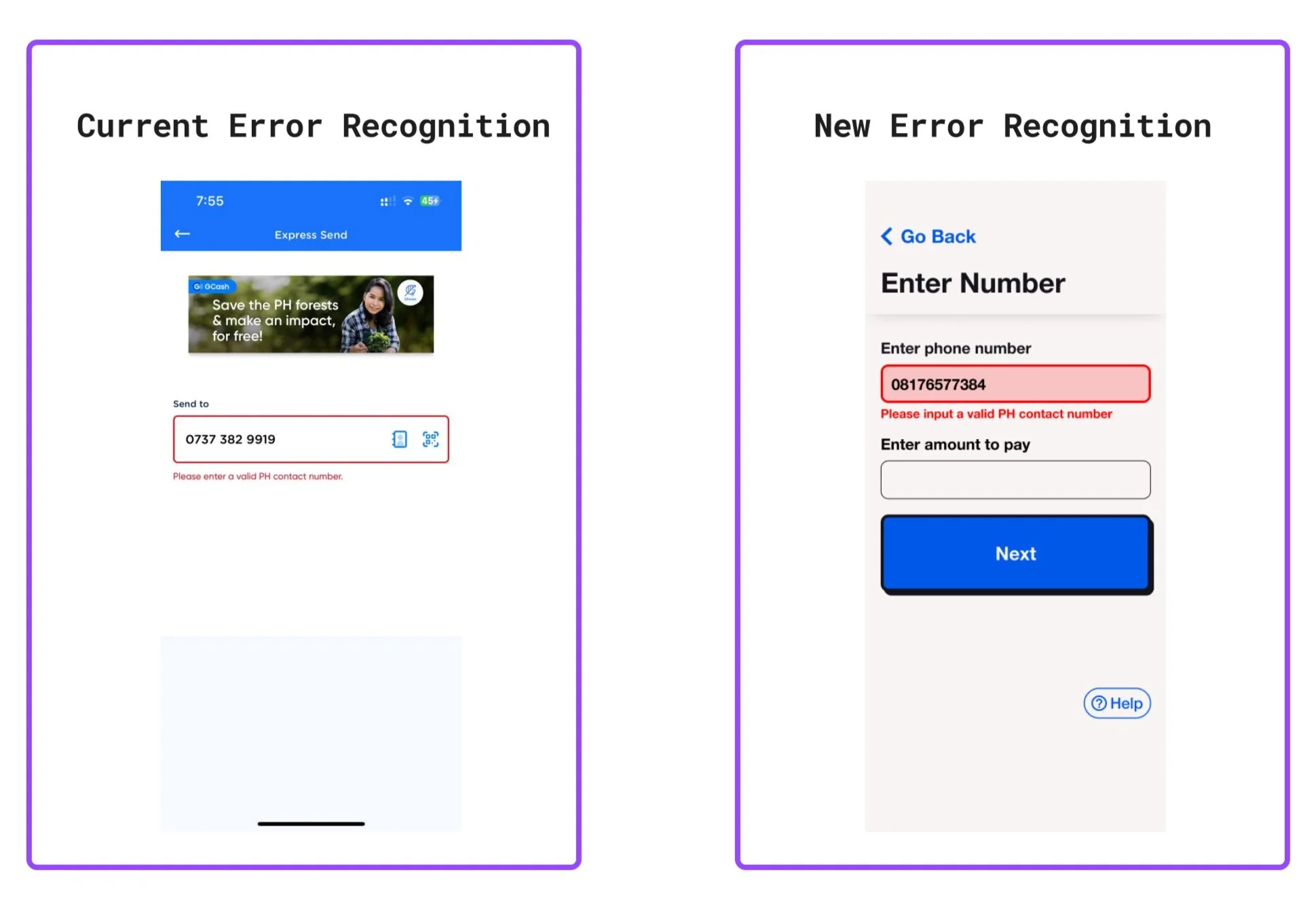
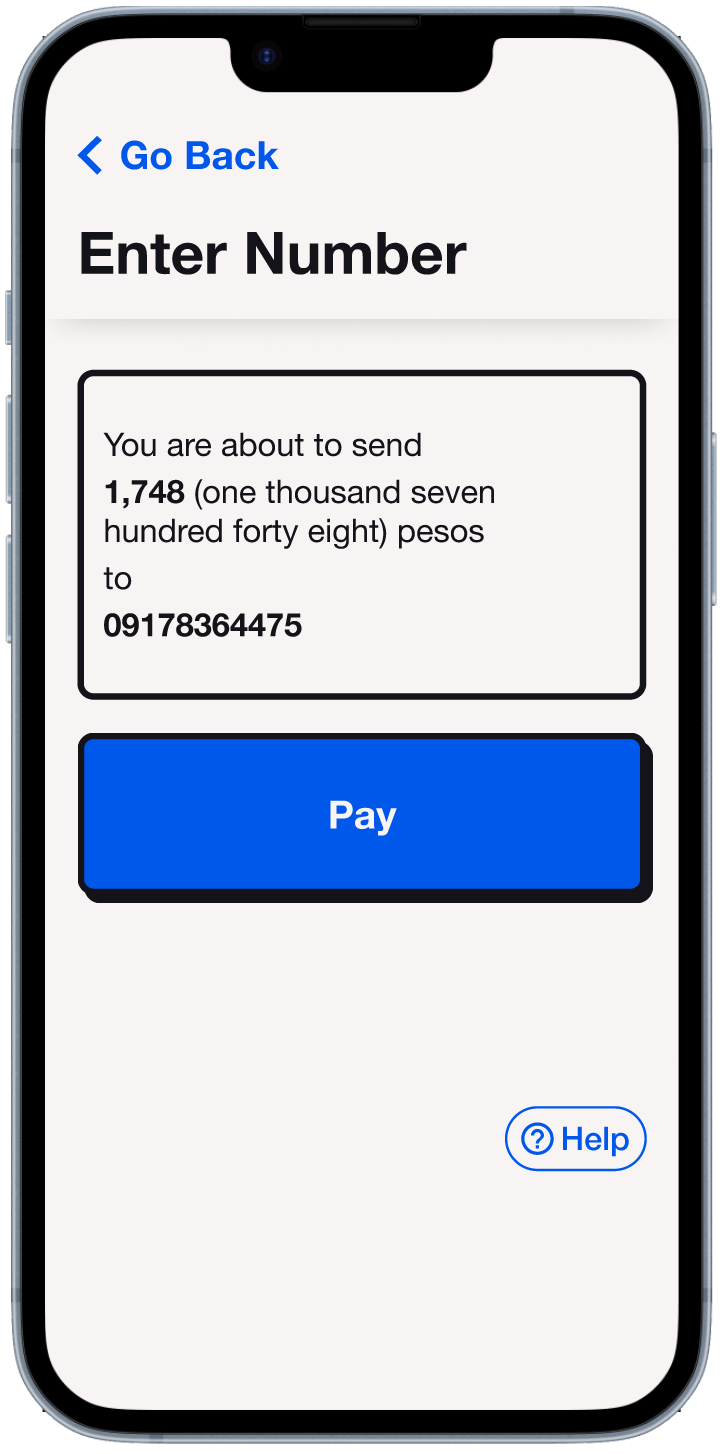
One time, my mom asked me to help her send money to someone because she couldn’t move on to the next step. She had accidentally typed out an invalid phone number, but wasn’t able to recognize her error. I actually thought that the current error message would have been sufficient, but I guess it isn’t as evident for people who are far sighted. To remedy this, I just made the stroke of the input field thicker, added a light red fill to the field, and made the error message a bit larger.